Leo Creative

  • Home
  • About
  • Our Approach
  • Our Work
    • Branding
    • Healthcare
  • Contact

Rebranding Australian Self Medication Industry (ASMI)

Client: CHPA

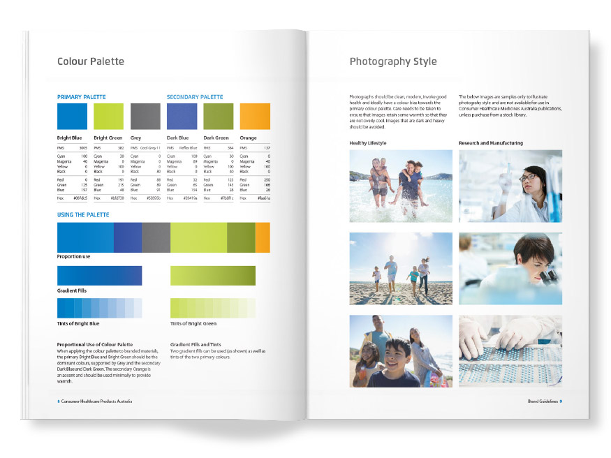
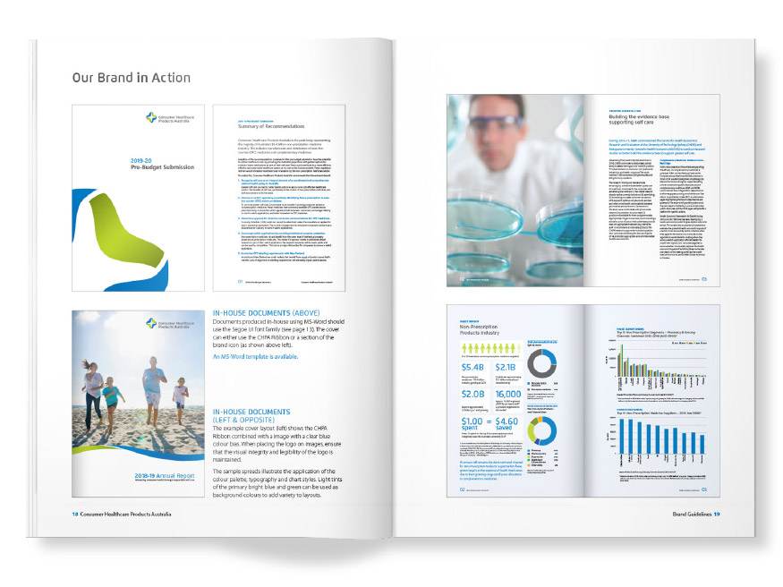
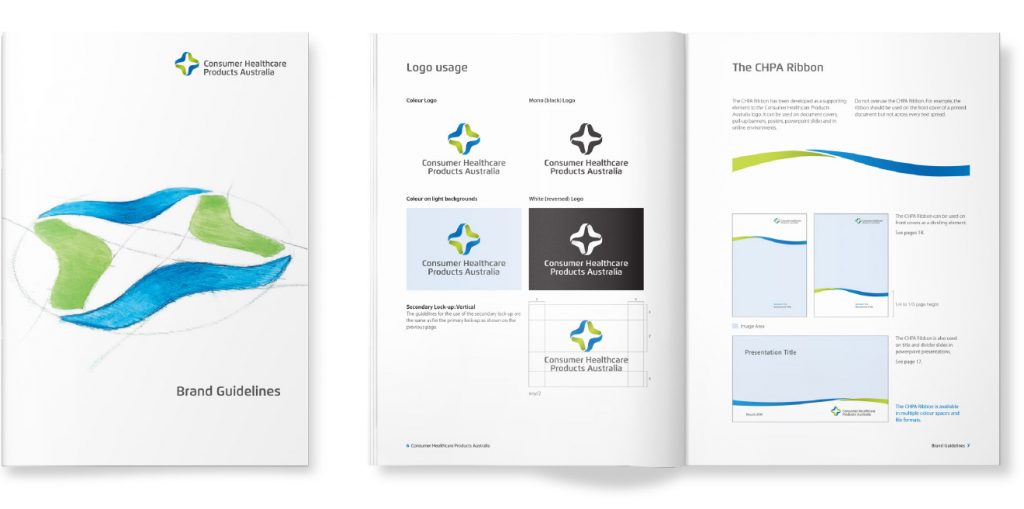
Leo Creative was engaged by the Australian Self Medication Industry (ASMI) to help them rebrand in 2019. ASMI was the industry association representing Australian manufacturers and distributers of consumer healthcare products, including non-prescription medicines.

Leo Creative worked with the CEO and senior executives in early 2019 to help prepare the business case for the rebrand. The work involved design audits (including competitor/comparator research), name development, logo design and brand identity design. It was clear during that process that “self medication” had unhelpful associations for the organisation. Another key consideration was ensuring that key stakeholders including members were engaged throughout the process.

In April 2019, ASMI members voted to change the name to Consumer Healthcare Products Australia, “to better represent the industry in which our members operate”. The new name “also brings us in line with our international counterparts, CHP Canada and CHPA in America.”

Filed Under: work

Vikings Disease: Disease Awareness Brand

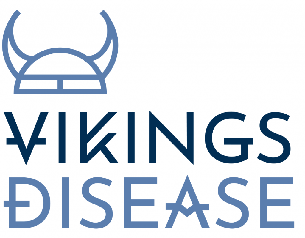
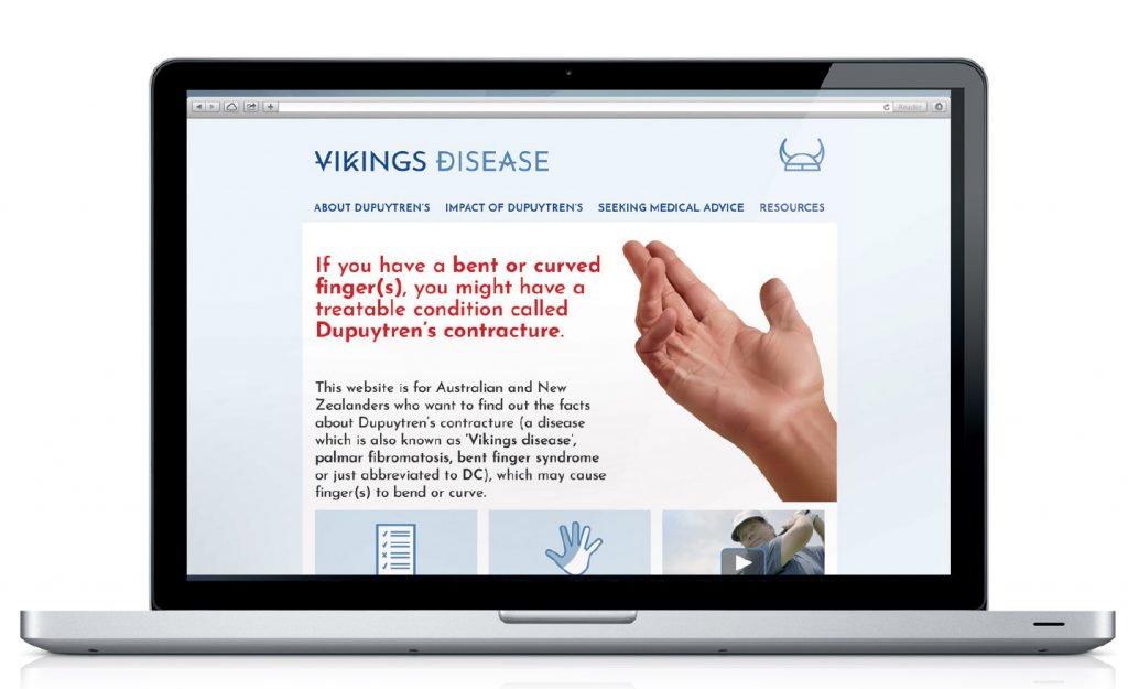
Leo Creative was commissioned to develop a disease awareness brand for Dupuytren’s contracture. Dupuytren’s contracture is also known as “Vikings Disease”, so with the name of the disease awareness brand complete, the task was to bring the brand to life.

Following research and exploration of Nordic typography, Leo Creative developed a logo and initial concepts for a website.

Filed Under: work

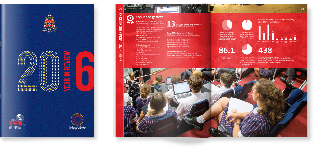
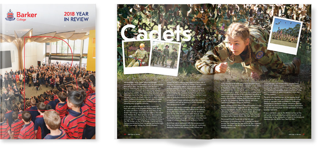
Barker Year in Review

Client: Barker College

Leo Creative has worked with Barker College for a number of years. The school has its own in-house communications team who design, write and produce a large number of documents throughout the year. Due to the high end-of-year workload for the team, Leo Creative has designed the schools Year in Review since 2016.

The best compliment we receive is when the schools communications unit receives positive feedback on a great looking document. Our task is to follow guidelines and ensure the publication is “on-brand”. If the school community thinks the document was produced in-house, we have met the brief.

Filed Under: work

PAH Clinic: Speaker Tour Issue

Client: Janssen Australia

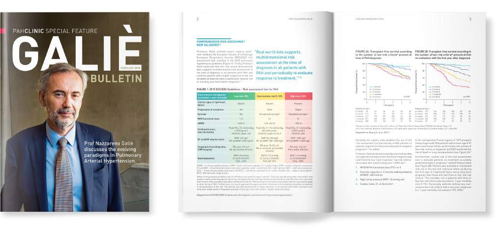
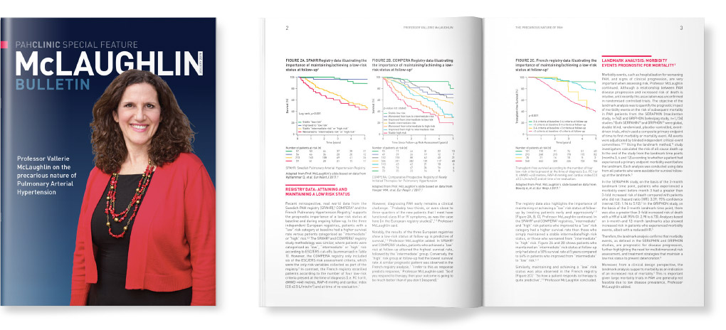
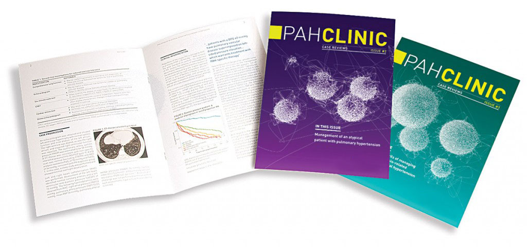
When Janssen Australia sponsored a world-renowned Pulmonary Arterial Hypertension (PAH) expert to visit Australia, Leo Creative was commissioned to design a range of educational material to engage with health care professionals (HCPs) in the Australian PAH community. To document the key messages of the tour, it was decided to extend the PAH Clinic masthead and produce a “special feature issue”.

Up to this point PAH Clinic had been a publication focussing on patient case studies. In contrast, this special feature highlighted key developments in PAH diagnosis and treatment, presented by a global key opinion leader directly involved in the creation of European PAH guidelines.

This piece is a great example of corporate, rather than product brand communication, with the objective to enhance and defend Janssen’s positioning as the leader in PAH. Since its publication, Leo Creative has produced additional special feature issues documenting global speakers and international PAH congresses.

Filed Under: work

Brand Identity: more than a logo

Client: NEXUS APAC Group

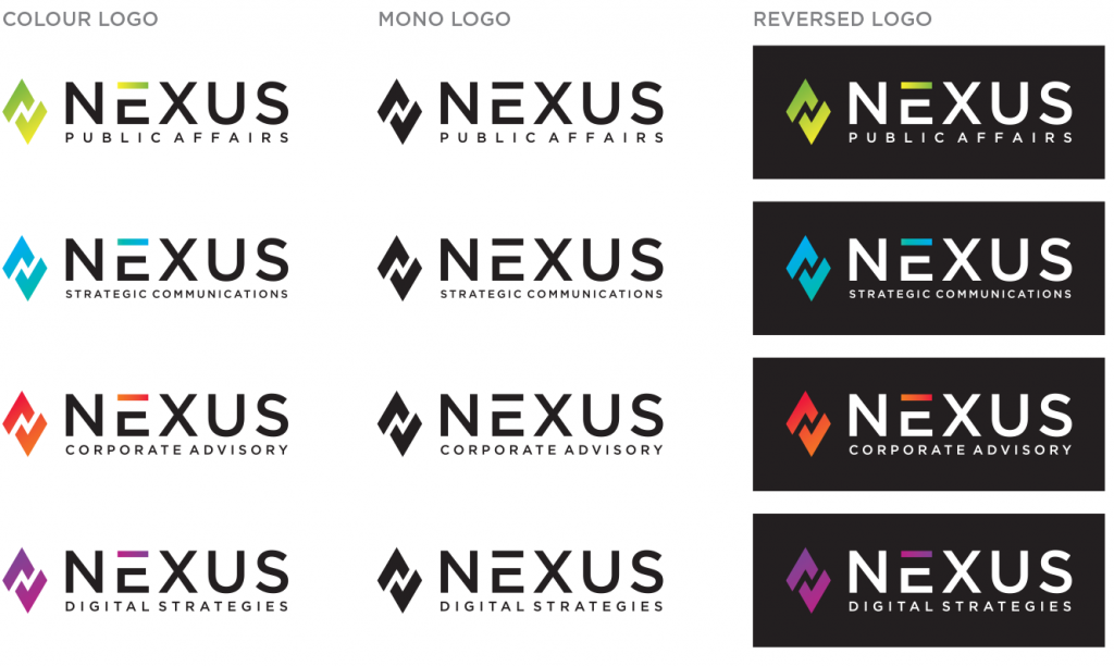
Many people mistakenly believe that a brand is just a logo, but that couldn’t be further from the truth. Even if we do just consider the visual aspect of a brand, it involves so much more than the logo itself – colour, typography, photography, illustration, graphic devices and layout. A great logo can be let down by poor application, but well considered extended visual brand identity can bring any logo to life.

NEXUS APAC Group is a leading public affairs and strategic communications firm. In 2019 the group underwent a name change from Capital Hill Advisory to reflect an expanded service offering that added to the groups heritage in public affairs and government relations. Leo Creative was referred to NEXUS by an existing client to assist with the rebrand process. A logo had already been created but the new brand had yet to be brought to life through the design of a broader visual brand identity system. Brand Guidelines also needed to be created to ensure that the new brand could be consistently be managed.

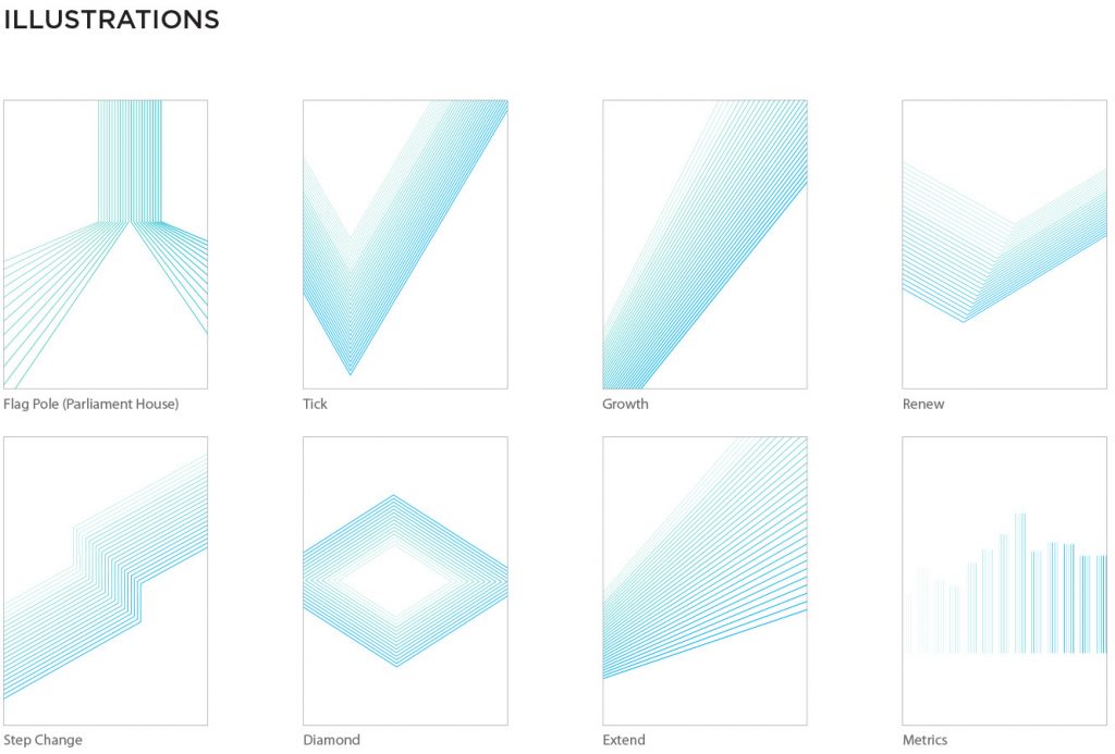
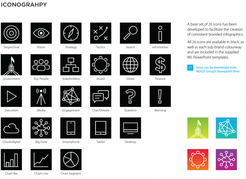
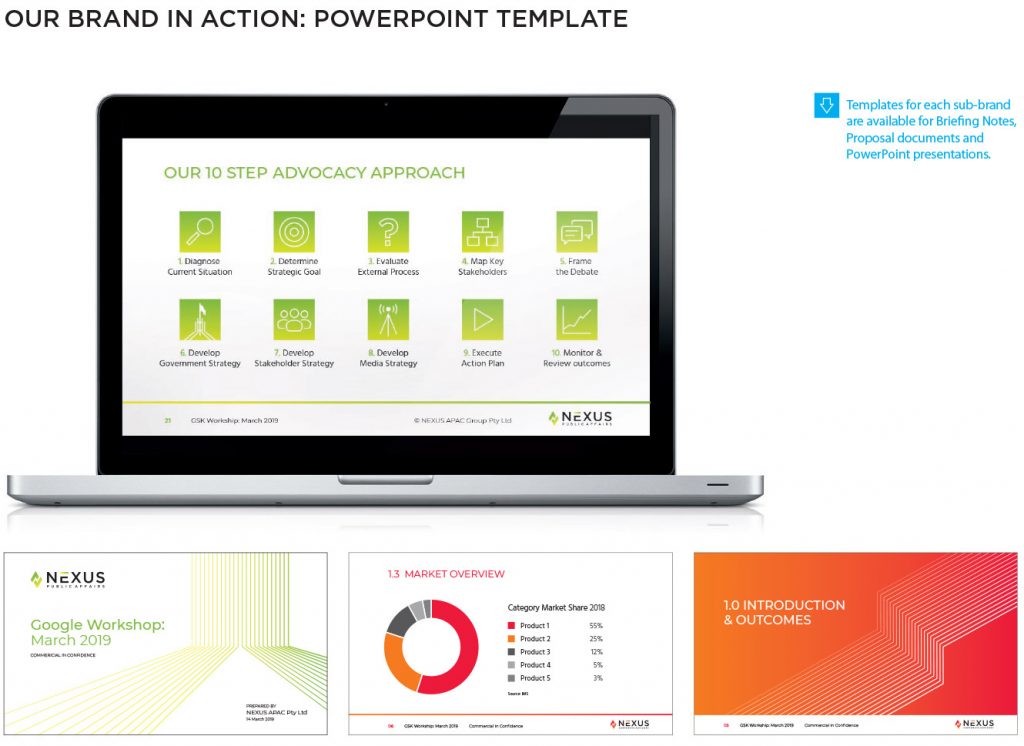
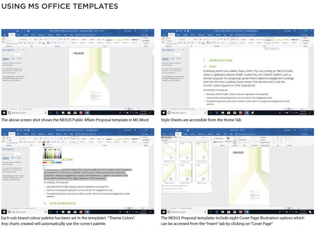
Leo Creative creative four new sub-brands to denote the groups core service offerings, with a colour palette for each sub-brand. As part of the brand identity design process, Leo Creative designed eight thematic line illustrations, an information graphics system including a set of icons and a comprehensive suite of Microsoft Office templates to assist the group produce branded communications in-house

In addition to MS Office templates, Leo Creative created a user-friendly guide to clearly define the use of the logo, colour, typography, imagery and layout in creating consistent branded visual communication.

Of course branding is more than just visual identity. It includes language, tone of voice,
personality and behaviour. The brands differentiating attributes should also be identified as well as a core idea or brand promise. 

Critically, the experience of the brand for all stakeholders must be consistent with the promises that the brand makes. This is an ongoing process that impacts every part of an organisation. For more information on our approach to branding click here.

Filed Under: work

Clinical Genomics capital raising

Client: Clinical Genomics Technologies Pty Ltd

CGT_Prospectus

CGT was formed in 2006 to discover and deliver healthcare products that address the unmet needs of large healthcare markets. The company sells stool tests for the early detection of colorectal cancer and in 2014 launched a commercial blood screening service.

Leo Creative was engaged by CGT to create a suite of presentation tools for a private capital raising.

Filed Under: work

Rebranding an industry association

Client: Generic Industry Medicines Association (GMiA)

gbma_feature_1
gbma_feature_1
gbma_feature_2
gbma_feature_2
gbma_feature_3
gbma_feature_3
gbma_feature_4
gbma_feature_4
gbma_feature_5
gbma_feature_5

The generic medicines industry is undergoing significant change. The introduction of a new category of medicines – biosimilars – was the catalyst for the GMiA to rename and rebrand to ensure that the industry association remained relevant to members and other stakeholders.

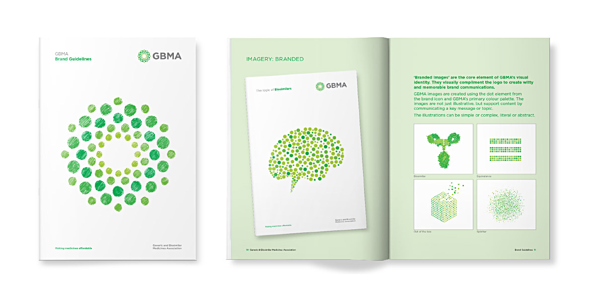
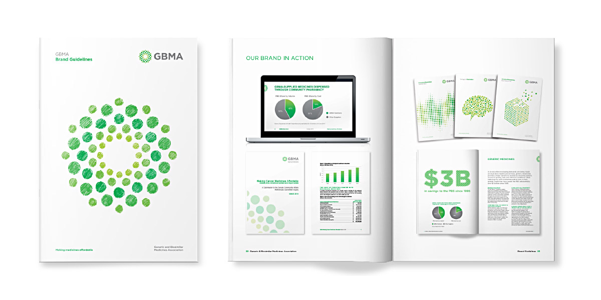
Leo Creative was engaged by the GMiA to undertake competitor research, facilitate workshops to define the brand and assess the need for a name change. Following the development of a long-list of names the organisation elected to change its name to the Generic and Biosimilar Medicines Association.

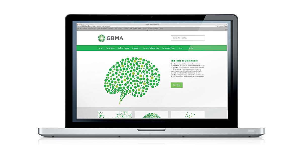
Leo Creative designed the new brand identity, guidelines and assisted with the launch of the new brand with a new website and core stationery items.

Filed Under: Uncategorized, work

Patient and physician demonstration kits

Client: Janssen Australia

veletri_demo

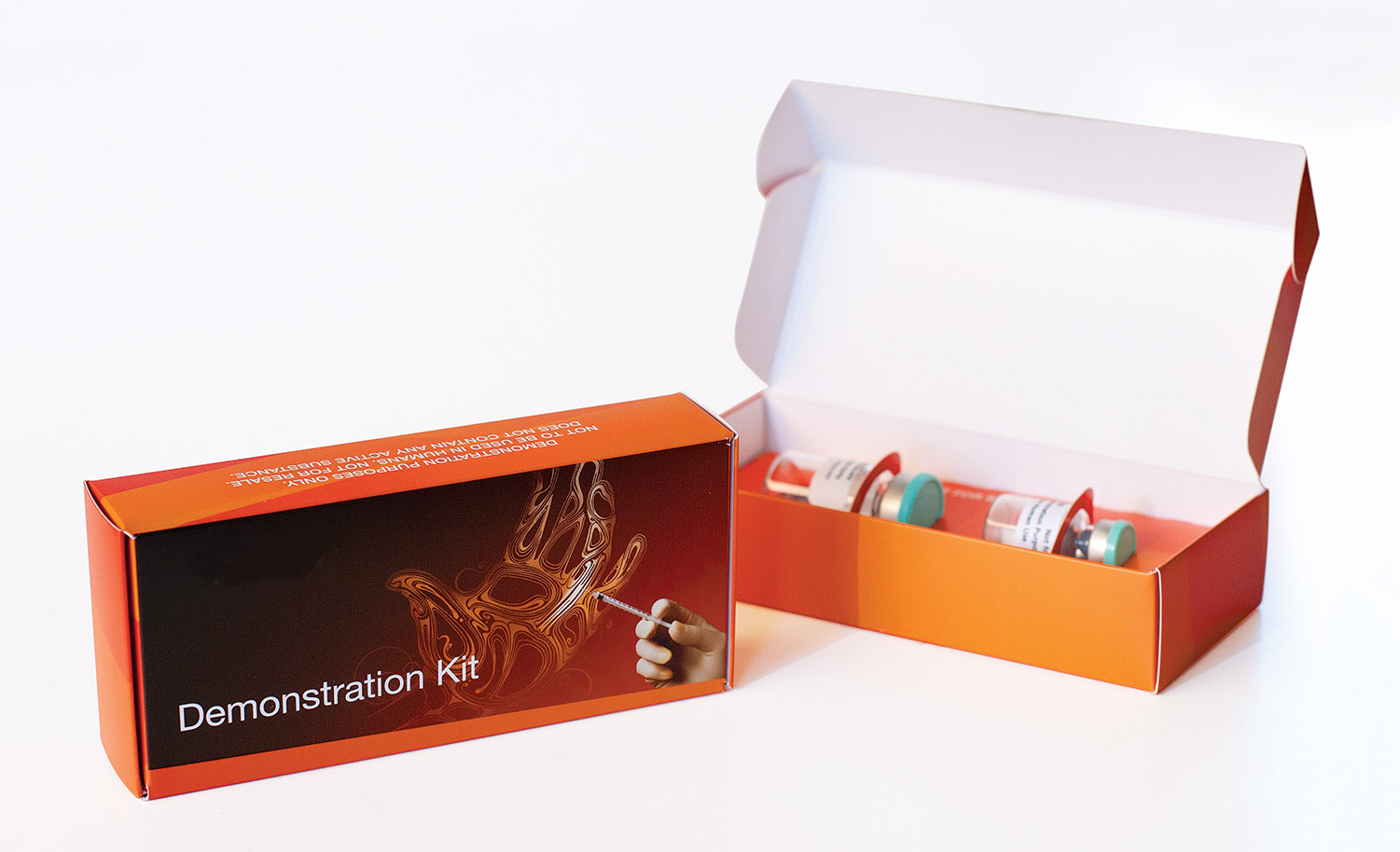
A common barrier to treatment with some drugs can be administration. This is certainly the case for Janssen’s treatment for advanced PAH, which is administered intravenously via a cassette and pump. With this in mind, Janssen developed a number of patient support tools including demonstration kits (containing placebo) for patients to practice the reconstitution process with their clinic nurse.

This approach was also relevant for collangenase in the treatment of Dupuytren’s contracture. Demonstration kits have proven to be invaluable in helping surgeons become more comfortable with the injection procedure, when surgery was a more familiar treatment option.

XIAFLEX_Demo_Kit

Leo Creative was engaged on both projects to design and produce cost effective packaging solutions.

Note: Product brands and names have been removed from pack shots

Filed Under: work

PAH Clinic

Client: Janssen Australia
PAH_Clinic

Janssen is a global leader in the science and medicine of Pulmonary Arterial Hypertension having launched the first endothelin receptor antagonist (ERA) bostentan, in 2001. Since then Janssen has development a portfolio of PAH treatments including macitentan and a generic epoprostenal with improved thermal stability.

When Janssen wanted to publish clinical case studies on bosentan, Leo Creative named and created PAH Clinic – a corporate (rather than product) branded, journal-like publication to reinforce Janssen’s leadership in PAH. The publication has proved to be one of Janssen’s most useful in-field resources – working across their PAH product portfolio and providing a vehicle for engaging with Key Opinion Leaders.

This regular publication has evolved over time beyond patient case studies to cover speaker tours and updates to global diagnosis and treatment guidelines.

Filed Under: work

Our approach to branding

There are many brand agencies out there and most approach branding from the foundation of one or two core competencies. There are agencies that have a background in advertising, practitioners who come from a business consulting background, marketers, PR consultants, researchers, and designers with a background in corporate identity. All are equally valid and offer a perspective on the branding process.

We have seen a lot of approaches to branding that, in our opinion, are too complicated. Einstein said that “If you can’t explain it simply, you don’t understand it well enough.” Our brand model is simple. It provides a level of rigour whilst ensuring that the creative process is not inhibited.

What is a brand?

Before looking at our brand model, we need to ask an important question – what is a brand? Put simply, a brand is a promise of value. Brands allow us to express two basic human needs: a sense of belonging and a desire to differentiate ourselves from those around us. Brands facilitate choice.

Brand Discovery

brand_model_whiteFundamental to our belief about corporate branding is that brands are revealed not manufactured. Authenticity in brand building is incredibly important – we all know a fake brand when we see one.

Our first step, therefore in building strong brands is research. Depending on the project brief and budget, brand discovery can include:

  • Design audits
  • Competitor audits
  • Stakeholder interviews
  • Focus group research
  • Quantitative research
  • Workshops

Brand Promise

Once a complete picture of the brand and its competitive environment has been completed, Leo Creative works with the client, through a workshop-based process to define the Brand’s DNA.

At the heart of Brand DNA is the brand promise or core idea. The brand promise is what drives a brand – an internal statement that captures the brand’s central organising thought. A brand promise should be sustainable over an extended period of time.

Further definition is provided through a set of distinctive brand attributes. Too often brand attributes (or values) are merely ‘corporate speak’ – values that one could rightly expect to find in any successful, sustainable business eg. innovation, integrity, teamwork etc. Clearly there is nothing unique or distinctive about these values – they are baseline values. Brand attributes can be both tangible or intangible and may reflect the personal or organisational aspects of the brand.

Brand Expression

The brand expression phase is where brands are brought to life – how the brand looks, how it sounds and feels.

Brand Architecture
Many organisations own and manage multiple brands. The framework that describes how these brands relate to one another is called ‘brand architecture’. The architecture should be clear, easy to comprehend and consistent.

Brand Naming
Naming is arguably one of most challenging aspects of branding and name changes in particular are notoriously challenging. The trigger for a name change can be when the old name is badly tarnished, or the result of a merger or acquisition, a change of ownership, or a change in direction where the old name is no longer relevant.

Brand Icon
The prime identifier for almost all brands is the logo, symbol or icon. It is a distinctive mark that visually represents the core idea of the brand with impact, brevity and immediacy. The brand icon is the signpost for the brand.

Brand Identity
Brand identity is a critical component of brand expression, bringing together the key elements of the logo, colour palette, typography, imagery, shape, texture and layout to create visual brand story. Used consistently Brand Identity delivers a memorable visual feast that elicits an emotional connection.

Brand Theme
Unlike the brand promise, the brand theme is an external statement and is often referred to as a campaign theme or a tagline and can change in response to an evolving competitive environment.

Brand Language
Brand language defines how the brand speaks – is the language formal, conversational, technical, relaxed etc.

Brand Proposition/s
Unlike an FMCG brand where a single Unique Selling Proposition (USP) is king, corporate brands often require tailored propositions for each key stakeholder group eg. employees, customers, partners, suppliers, government, regulatory bodies, media, interest groups etc. These statements then become the foundation of a broader communications plan.

Brand Guidelines
Every successful brand operates under brand guidelines. They are designed to inform and motivate, and are essential in forming and reinforcing a strong internal brand culture. A comprehensive suite of information, the guidelines ensures a consistent execution of the brand by anyone who ‘touches’ the brand, including staff and third party suppliers.

Brand Action

As stated above, authenticity in branding is vital. In other words:

Behaviour = Brand = Reputation

‘Living’ the brand is the responsibility of every employee and the brand should inform and influence all aspects of an organisation including:

  • Recruitment
  • Learning & Development
  • Remuneration
  • Policies & Procedures
  • Operations
  • Marketing
  • Product Development
  • Finance
  • Investor Relations
  • Corporate Social Responsibility

For this reason ‘branding’ is often used as a change management tool.

Filed Under: work

  • 1
  • 2
  • Next Page »

Barker College Prospectus

Client: Barker College When Leo Creative was asked to create a new enrolment prospectus, we knew photography would be critical in communicating school life. We teamed up with Barker’s … MORE

Rebranding Australian Self Medication Industry (ASMI)

Client: CHPA Leo Creative was engaged by the Australian Self Medication Industry (ASMI) to help them rebrand in 2019. ASMI was the industry association representing Australian manufacturers and … MORE

The role of branding in highly specialised markets

In our post “What we believe about pharma branding”, we gave a brief overview of the history of branding and the adoption of the FMCG branding model by big pharma where value is driven by the … MORE

A new brand story for Barker College

An audit of Barker College’s advertising and a review of quant and qual research led to a new brand story for Barker College. Following the successful delivery of a new enrolment prospectus, Barker … MORE

Copyright © 2025 Leo Creative Pty Ltd · Genesis Framework by StudioPress · Log in